
Americans are no strangers to fitness. The U.S. health and wellness market was worth an estimated $30 billion in 2018, and an estimated 12% of Americans joined a gym in January of 2019. But even so, 2 in 3 American adults are clinically overweight or obese, according to the U.S. Department of Health and Health Services. This crisis, however, is not just about eating less and moving more –a long list of factors, such as geographic access to healthy foods, family income level, and public school lunches can contribute to people’s waistlines.
But in a nation where the majority of individuals are overweight, one has to wonder: What makes a person healthy? To find out, we analyzed data from the Centers for Disease Control and Prevention (CDC) to learn key trends about America’s fit minority. Read on to see how one’s home state, diet, education, and income can affect his or her overall health.
Health Across America
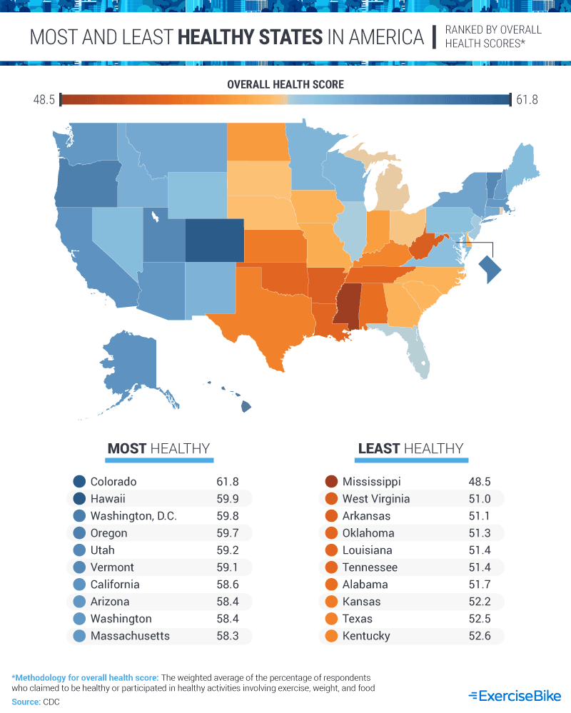
Where we live can affect our waistlines and overall health. Based on our analysis of government health data, Americans living in the West, as well as the Northeast, were generally much healthier than those living in the Midwest and South. Colorado, for example, stood out as the healthiest state, with an average score of 61.8 across all of the CDC’s question regarding health and wellness. Hawaii ranked at No. 2, with an average score of 59.9 for its residents. Other top-ranking healthy states included Washington, D.C., Oregon, Utah, Vermont, and California.
Meanwhile, Mississippi stood out as the least healthy state. With an average health score of 48.5, it was the only state to fall below an overall average of 50. West Virginia, Arkansas, Oklahoma, Louisiana, and Tennessee also were among the least healthy states. Although no single factor can explain this phenomenon, experts have speculated that the lack of walkability and limited access to health care could factor into the American South’s generally unhealthy ratings.
Gender Differences
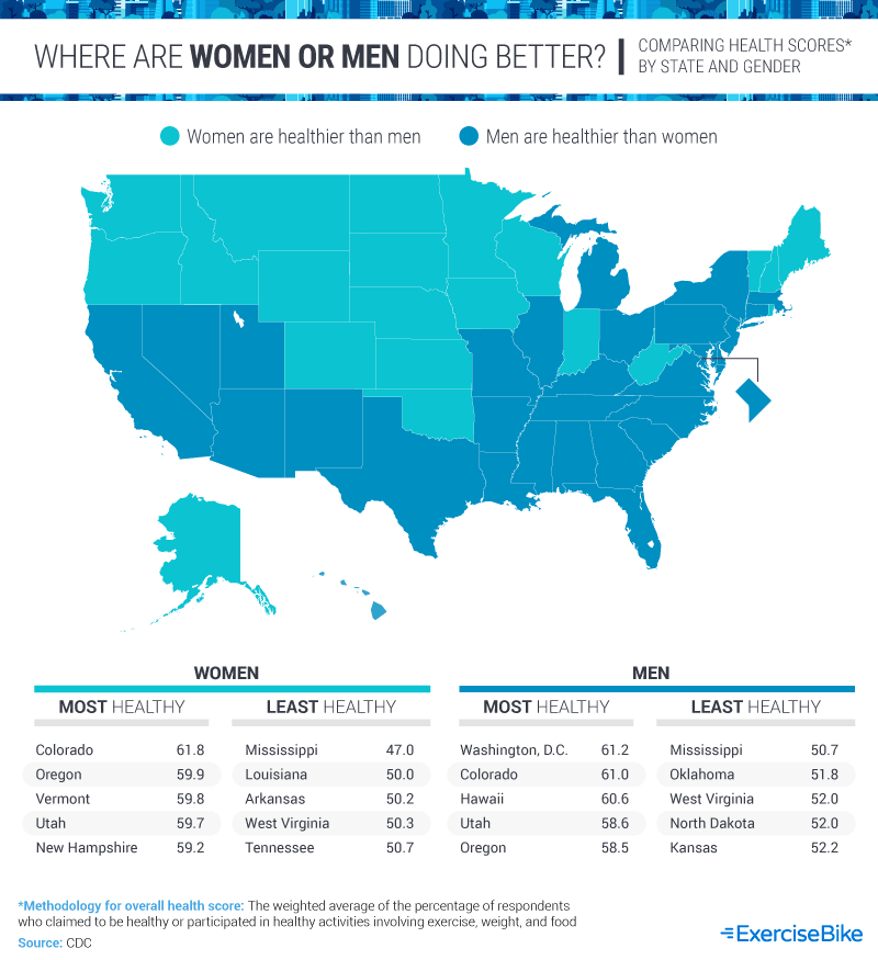
Most Americans are above their recommended weight, but men are more likely to be overweight or obese. In the U.S., nearly 74% of American men meet these criteria, compared to around 67% of American women.
Our analysis of government data suggests that, for whatever reason, men and women are more or less healthy depending on where they live. Colorado, for example, had the highest percentage of healthy women, with an average overall health score of61.8. Washington, D.C., ranked at the top for men, with an average rating of 61.2. Mississippi again ranked at the bottom of the list for both men and women, with women being slightly less healthy at a score of 47. Similar to broader national trends, the South and Midwest had lower overall health scores for both men and women than their coastal counterparts.
States of Change
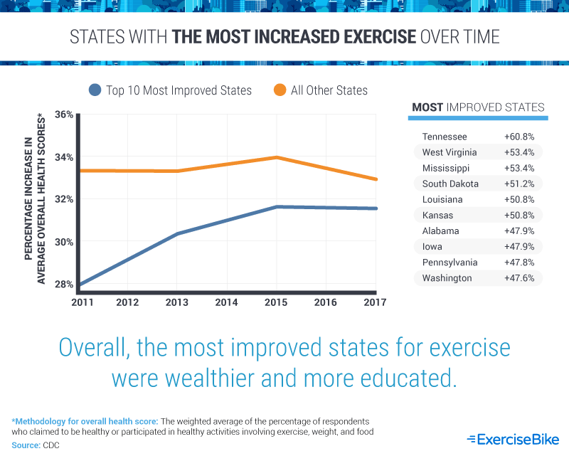
States are not doomed to have unhealthy citizens forever. In fact, our data suggests that some states have seen dramatic rises in the average amount of exercise among residents in recent years. Tennessee stood out as the most improved state, with a nearly 61% increase in exercise scores between 2011 and 2017. West Virginia, Mississippi, South Dakota, Louisiana, and Kansas were also among the most-improved states during this period.
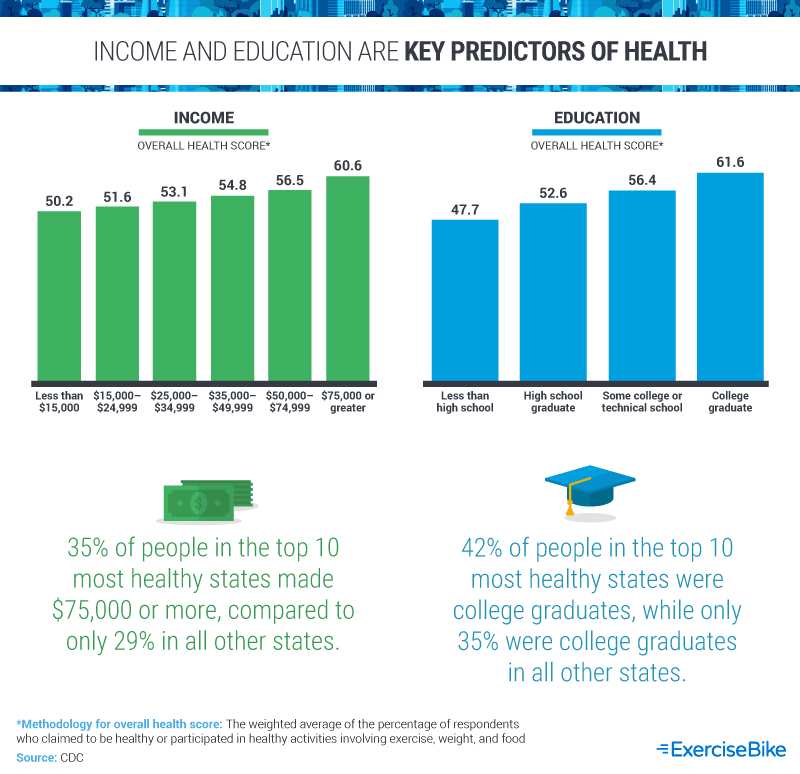
Two of the best predictors of health outcomes are income and educational attainment. In our sample, we saw statistically significant differences between the top 10 most healthy states and the rest of the U.S. Earning a college degree compared to a high school diploma was associated with a nine-point jump in average overall health scores, and a similar increase was seen between individuals making between $15,000 and $24,999 per year and those earning $75,000 or more annually. While less education and lower income are by no means the sole drivers of poor health outcomes, it is startling to see how large the gap is based on these measures.
Overall Health Habits
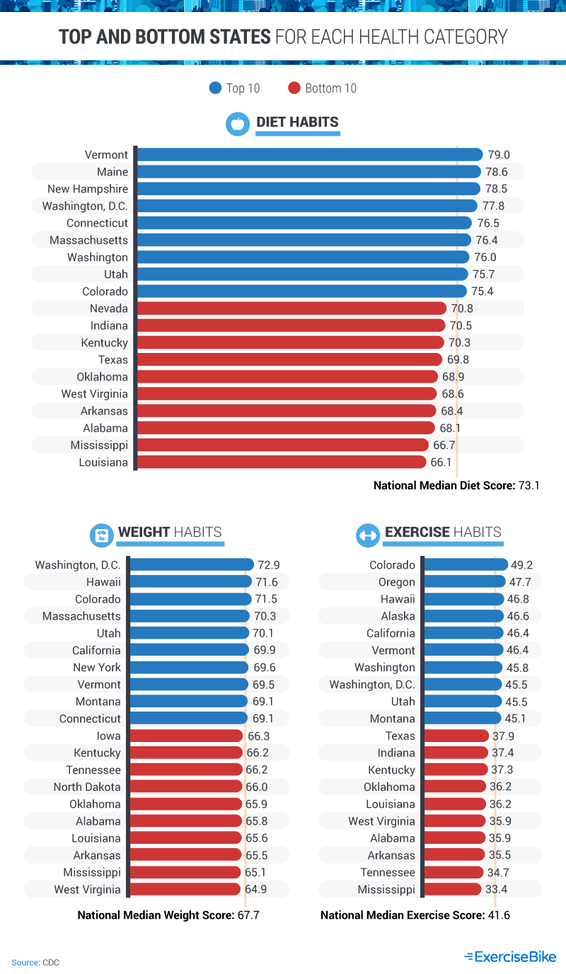
It’s no secret that our health is made up of a combination of lifestyle factors, such as one’s weight, activity level, and diet. For a more holistic view of health around the U.S., we analyzed government data on all three of these factors. Our results suggest that more healthy states ranked high for all three of these categories, while less healthy states tended to rank lower. Washington, D.C., for example, ranked among the top 10 for diet, exercise, and weight, along with Vermont. Meanwhile, Mississippi, Alabama, and Arkansas ranked in the bottom 10 for all three categories.
Exercise habits were comparatively worse than dietary ones for Americans, and the gap between the average score for the top state (Colorado) and bottom state (Mississippi) was wider than any other measure at a 15.8-point difference. Scores were much closer for weight scores, with only eight points separating the top (Washington, D.C.) and bottom (West Virginia) placements.
Health Scores, by Gender
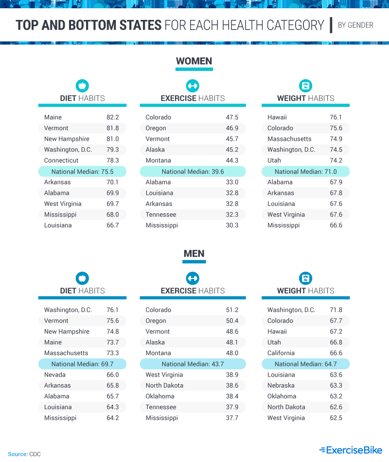
We’ve already established that gender, geography, and lifestyle can significantly impact one’s overall health. And, as it turns out, some states lend themselves to healthier diets, exercise habits, and weight for each gender. Maine had the highest health score for women’s diet habits, for instance, while Colorado had the highest score for female exercise habits and Hawaii for female weight. Meanwhile, Louisiana scored the lowest for female diet habits, while Mississippi scored the lowest for female exercise and weight.
For men, diet and weight were generally best in Washington, D.C., while exercise habits generally scored the lowest for men in Mississippi. Men in Colorado had the highest exercise scores, while West Virginia scored the lowest for male weight. All of these results are similar to greater national trends, which indicate there are health differences between the genders – but geographically, Southern and Midwestern states tended to score the lowest, while Northeastern and Western states scored the highest for health.
Education and Economic Factors
Wealthier and more highly educated individuals tend to make healthier choices – and quite frankly, it’s because they have the privilege and power to do so. These individuals usually are more able to buy healthy foods, pay for better health care, and reduce stress in their lives (and stress is closely linked with weight issues). But which of these factors are more important, if any at all?
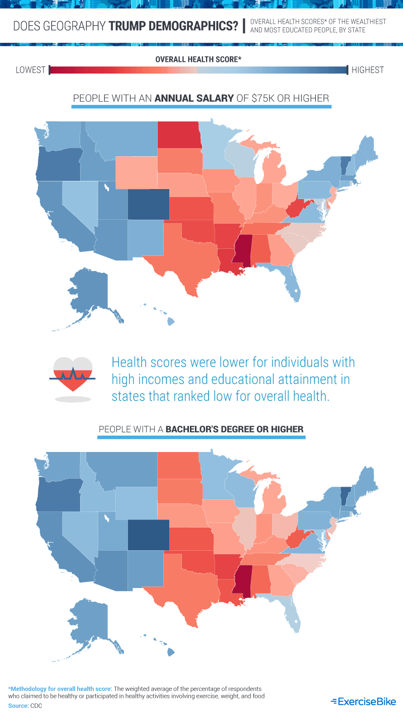
Our analysis indicates that geography has a significant impact on individuals’ overall health. Although the highly educated are more likely to be healthy, a higher percentage of college graduates were still healthier in the West and Northeast. At the same time, the health of those with an income of $75,000 or higher also tended to be more healthy in these regions. Therefore, while all these factors are important, geography might trump other demographics.
Keeping Healthy
Health and fitness are, no doubt, some of the most important indicators of a long life, but where we live can often pose a significant advantage (or disadvantage) to achieving a healthy life. Research suggests that life expectancy varies significantly depending on where Americans live, with gaps in life expectancy sometimes being as wide as 20 years depending on the state (as is the case with some counties in Colorado versus South Dakota, for example).
We analyzed government data to see where some of the most healthy Americans live – and why there’s such a large geographical disparity across the U.S. In the process, we uncovered some key details worth further studying, such as gender differences in health and healthy habits between states. Maintaining one’s health is a lifelong endeavor and requires attention to nutrition, exercise, and living an overall healthy lifestyle. To learn more about how in-home equipment can help you reach your fitness goals and live a healthier lifestyle, visit ExerciseBike.net.
Methodology
All data are from CDC/BRFSS.
The metric used to compare states is called the “overall fitness score.” The overall fitness score is defined as the weighted average of survey responses to provide a general understanding of how fit the survey respondents are. The dataset only provides survey questions with the overall percentage answer, as well as demographic data associated with the question. This was used to find the weighted average for each question response. For questions that were negative, such as “percentage who eat one vegetable per day,” the inverse was used so that in each scenario, a higher score was associated with a more desirable health outcome.
The scores from the CDC/BRFSS survey were as follows:
- Percentage of adults aged 18 years and older who have an overweight classification
- Percentage of adults aged 18 years and older who are obese
- Percentage of adults who achieve at least 150 minutes a week of moderate-intensity aerobic physical activity or 75 minutes a week of vigorous-intensity aerobic activity (or an equivalent combination)
- Percentage of adults who achieve at least 150 minutes a week of moderate-intensity aerobic physical activity or 75 minutes a week of vigorous-intensity aerobic physical activity and engage in muscle-strengthening activities two or more days a week
- Percentage of adults who achieve at least 300 minutes a week of moderate-intensity aerobic physical activity or 150 minutes a week of vigorous-intensity aerobic activity (or an equivalent combination)
- Percentage of adults who engage in muscle-strengthening activities two or more days a week
- Percentage of adults who engage in no leisure-time physical activity
- Percentage of adults who report consuming fruit less than one time daily
- Percentage of adults who report consuming vegetables less than one time daily
All data were analyzed using Python 3.7.1, and preliminary visualization layouts were completed in Tableau 2019.2. The margin of error for all BRFSS data reported ranges from 0.14% to 1.45%.
Sources
https://www.forbes.com/sites/benmidgley/2018/09/26/the-six-reasons-the-fitness-industry-is-booming/
https://www.vox.com/the-goods/2019/1/9/18175978/planet-fitness-crunch-gyms-memberships-new-years-resolutions
https://www.niddk.nih.gov/health-information/health-statistics/overweight-obesity
https://www.cdc.gov/obesity/data/prevalence-maps.html
https://www.vice.com/en_us/article/59kb4b/why-is-the-south-less-healthy
https://www.oecd.org/eco/growth/relationship%20education%20and%20obesity.pdf
https://frac.org/obesity-health/low-income-food-insecure-people-vulnerable-poor-nutrition-obesity
https://www.medicinenet.com/does_stress_make_you_fat/ask.htm
https://www.scientificamerican.com/article/u-s-life-expectancy-varies-significantly-based-on-location/?redirect=1
https://www.healthaffairs.org/do/10.1377/hpb20180817.901935/full/
https://www.oecd.org/eco/growth/relationship%20education%20and%20obesity.pdf
Fair Use Statement
Staying healthy is all about community, and in that same spirit, we hope you will share our work with others. You are free to use the contents of this article for any noncommercial purposes, but please include a link back to this page so that our authors can be credited for their work.